
Why I’m Only 30% Inverse (Even Though Every Metric Is Screaming)
Let me be clear: market timing is hard. Really hard. That’s why I’ve kept my reverse exposure to just 30% in my 3xPhoenix portfolio. Since I started this in April, every loss has come from the same mistake—I shifted into reverse exposure too early. Markets can stay crazy longer than you can stay solvent, as they say. And yet… the valuation numbers we’re seeing today are so extreme they demand attention and smart risk management.
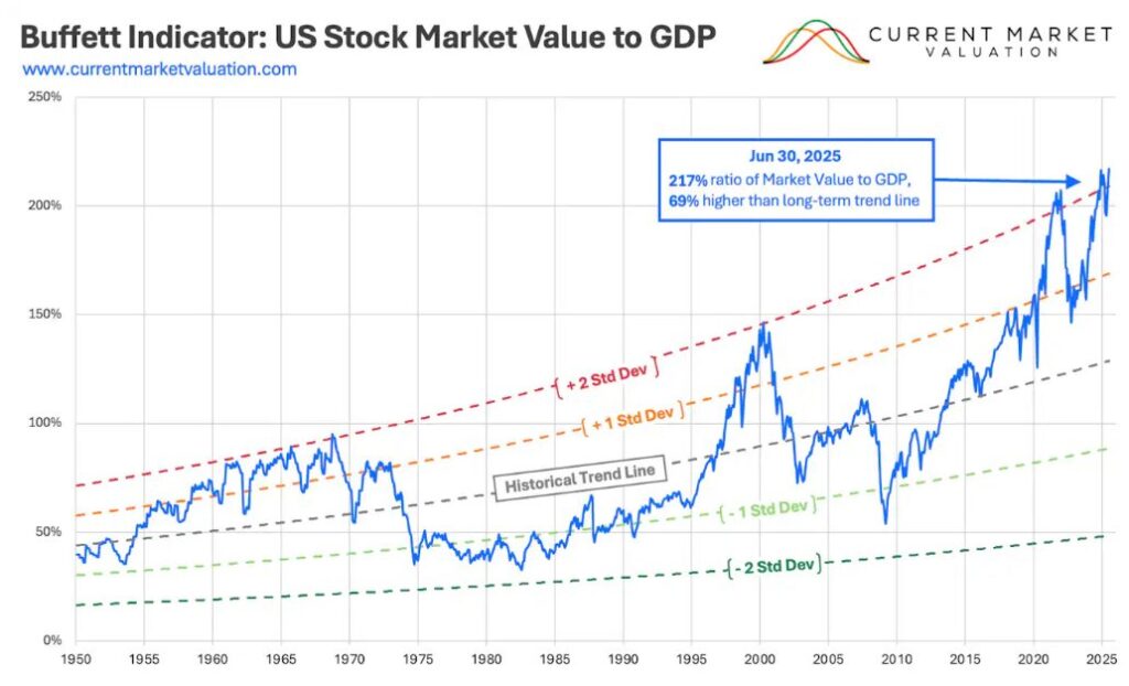
Buffett’s Favorite Indicator Says We’re Playing With Fire
Warren Buffett once called the market cap-to-GDP ratio “probably the best single measure of where valuations stand.” As of October 2025, this indicator sits between 217% and 226%.
Here’s some context: the normal range is 80% to 120%. Buffett himself warned that levels over 200% mean investors are “playing with fire.” Right now we’re at 2.2 standard deviations above the trend line. That means the market is strongly overvalued compared to the economy.
The math is simple: U.S. stock market value is about $65.5 trillion. Our GDP is around $30 trillion. Stock prices have grown more than twice as fast as the economy itself. When that happens, history says we may be in a bubble.
Now, here’s an important point: markets can stay overvalued for years. The indicator can sit above its average for a long time. Trying to time the exact peak is foolish. But here’s what history shows: when we go beyond two standard deviations—where we are now—we don’t stay there long before reality crashes back down. Markets can drift along at high valuations. But they rarely stay at these extreme levels. See the chart below for how this has played out historically.
Every Valuation Model Is Flashing Red (And Has Been for Years)
Beyond the Buffett Indicator, other valuation models are screaming overvaluation. These models try to answer a simple question: are stocks fairly priced? They compare current market values to the economic fundamentals that should anchor them long term. Right now, every major metric—from the Shiller CAPE to Tobin’s Q—is flashing red. The market is way overvalued compared to history.
And they’ve been red for years. The Buffett Indicator first went over 200% in February 2021. It pulled back during the 2022 bear market. Then it climbed even higher in 2024-2025. The CAPE ratio has been high since the late 2010s. It dipped to around 27 at the end of 2022. Since then it’s surged near dot-com bubble levels. We’re now about 4-5 years into this period of extreme valuations. That’s a very long time to stay this stretched. When multiple metrics all signal danger for years on end, it’s worth paying attention—even if we can’t know when a correction will hit.
The CAPE Ratio: We’ve Only Seen This Once Before (Right Before the Dot-Com Crash)
The Shiller CAPE Ratio was created by Nobel Prize winner Robert Shiller. As of October 2025, it stands between 39.5 and 41.2. This metric smooths out short-term swings. It compares the S&P 500’s price to average inflation-adjusted earnings over ten years.
The long-term average for CAPE is about 16-17. Today’s reading is the second-highest ever. The only time it was higher? Right before the dot-com bubble burst in 1999-2000, when it hit 44.2. At 39-41, we’re paying roughly 2.5 times the normal premium for corporate earnings.
What makes this scary? High CAPE ratios have always meant lower future returns. When CAPE has been this high before, the next 10 years of stock returns were below average or even negative. This doesn’t tell us when a crash will happen. The ratio stayed high for years in the late 1990s. But it does mean we should expect lower returns ahead.
Tobin’s Q: Companies Are Valued at 2X What It Would Cost to Rebuild Them
Tobin’s Q Ratio comes from Nobel Prize winner James Tobin. It compares the market value of all U.S. companies to what it would cost to replace their assets. As of September 2025, this ratio is about 1.98. That’s 136% above its historical average of 0.84.
In theory, Tobin’s Q should be around 1.0. That means the market values companies at roughly what it would cost to rebuild them. A Q ratio well above 1.0 means markets are pricing in huge intangible assets, future growth, or pure speculation that goes way beyond tangible assets.
The current reading of 1.98 is near the all-time high of 2.09 from May 2025. Using the geometric mean (which some analysts prefer), the Q ratio is 164% above its historical average. Like the other metrics, Tobin’s Q only hit similar levels once before—during the dot-com bubble peak. The 1982 low of 0.29 (65% below replacement cost) was one of the best buying chances in modern history.
So What’s an Investor to Do?
I’m not saying I know when or if these high valuations will correct. Markets can stay crazy for a long time. Structural changes in the economy—lower interest rates, the rise of intangible assets—may support higher valuations than history suggests. But when the Buffett Indicator, Shiller CAPE, and Tobin’s Q all flash warning signs at levels seen only once before (right before the dot-com crash), some defensive positioning makes sense.
That’s why I’m 30% inverse—not 100%. It’s a hedge, not a bet. I’ve been wrong about timing before. I’ll be wrong again. But in a market this stretched, protecting some capital while staying positioned for more upside feels like the right balance between fear and greed.